

Cornelsen school book publisher
Against the backdrop of massive market and media changes, Cornelsen as the leading provider of educational media in the German-speaking region has reviewed its strategic basis and rephrased the brand positioning. Cornelsen commissioned kleiner and bold to check the existing corporate design with regard to the consistency with the new brand positioning and the appropriate application in digital media.

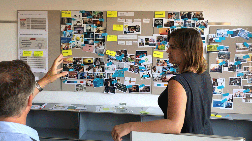
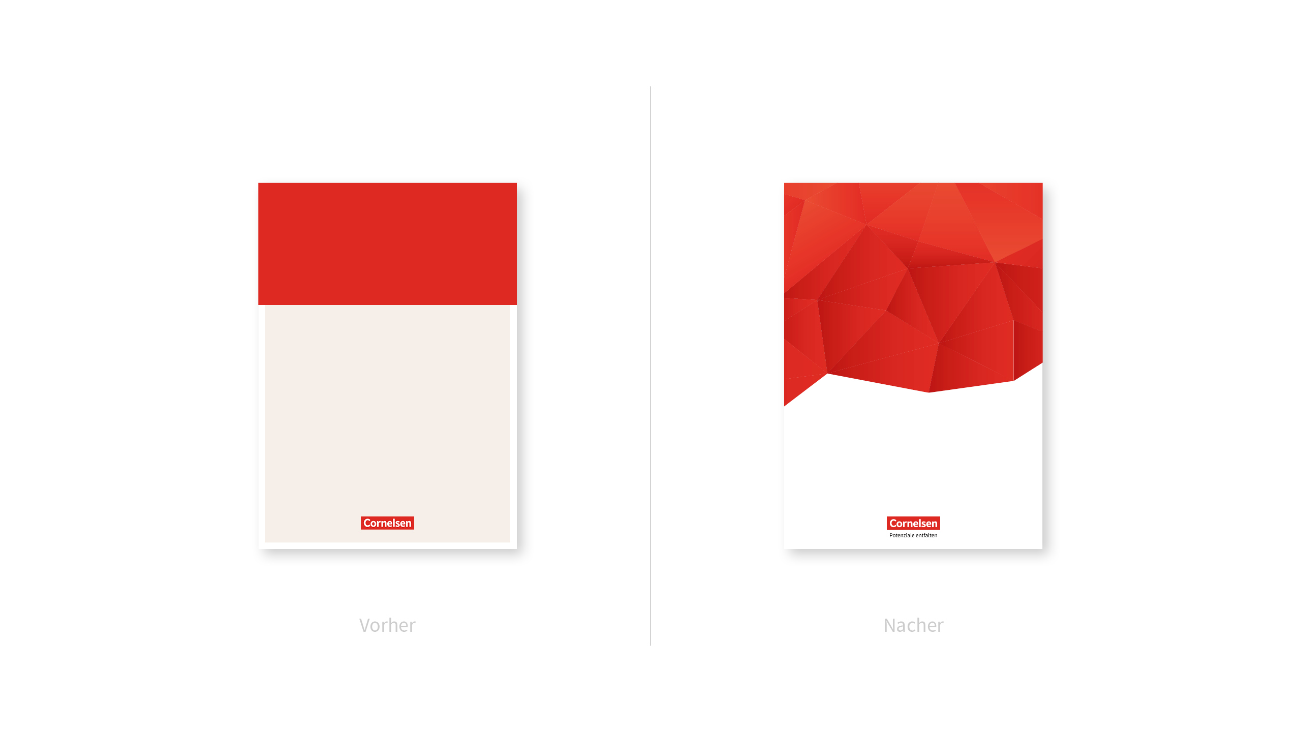


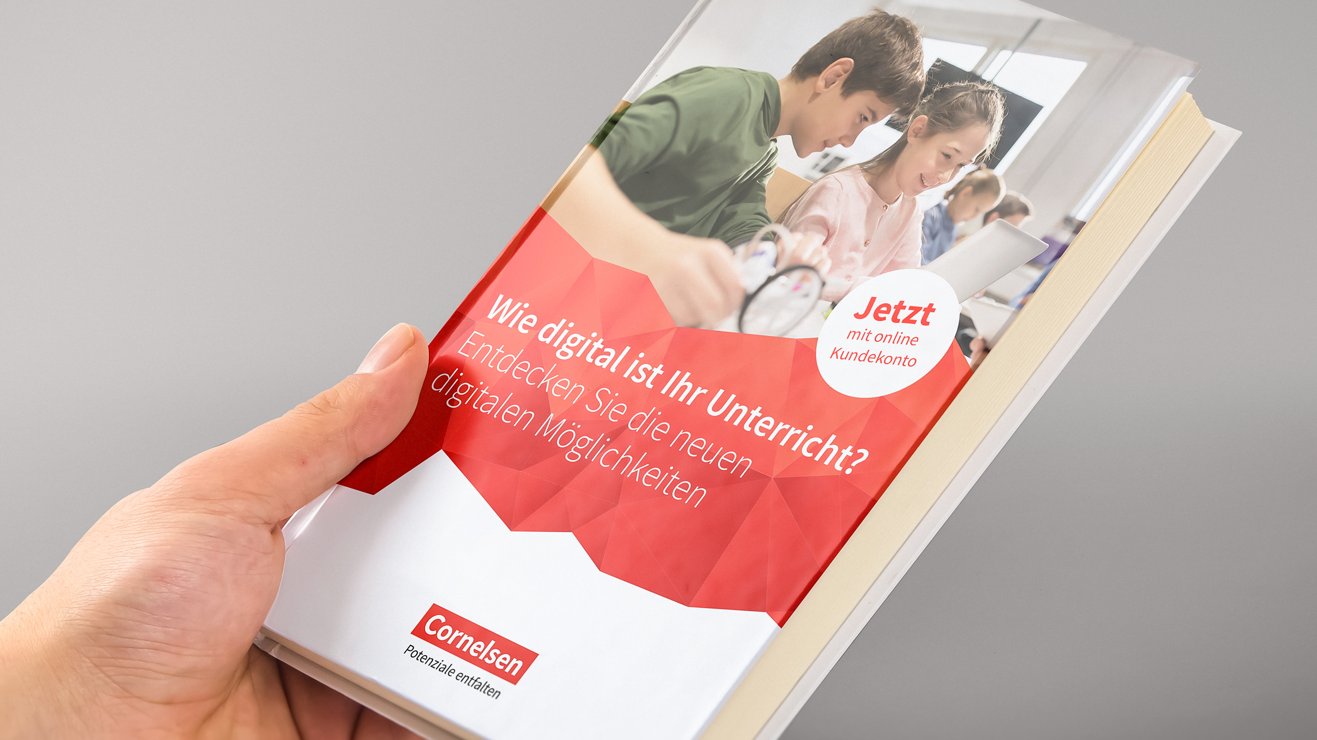

The goal was to change as little as possible to achieve as much as necessary. Following an elaborate brand audit and joint workshops, the decision was ultimately made to take the longest leap within the three visual approaches presented, despite this initially very reserved task. Simply because the multifacetedness hit the core of the brand positioning with a comparatively manageable effort.
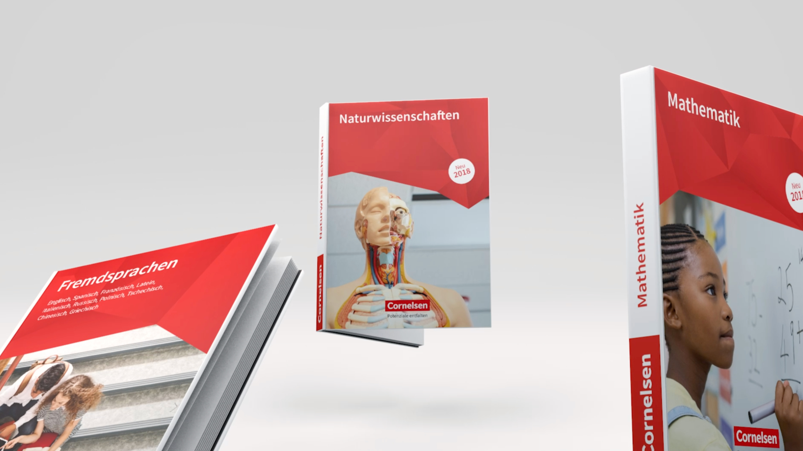
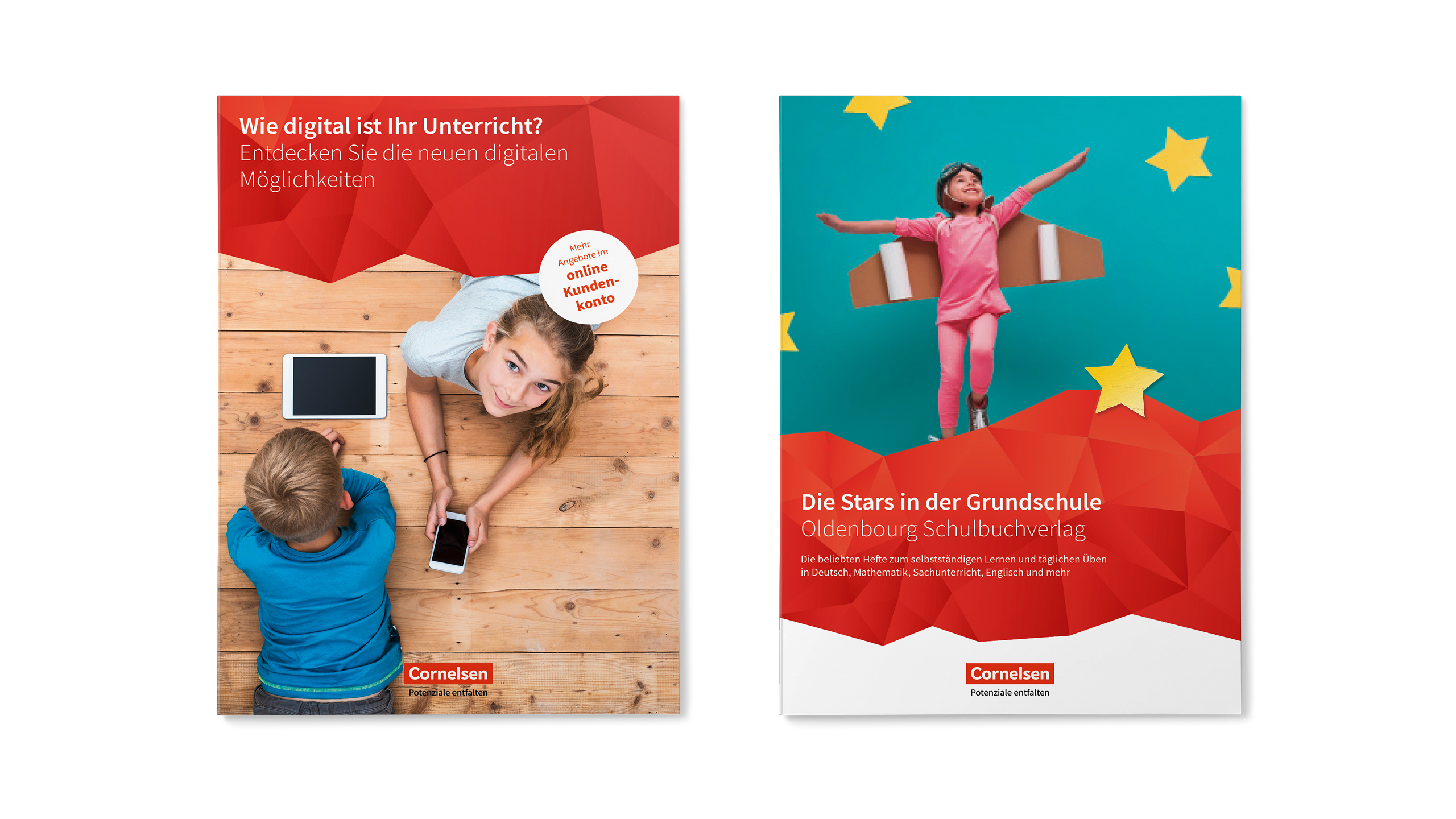
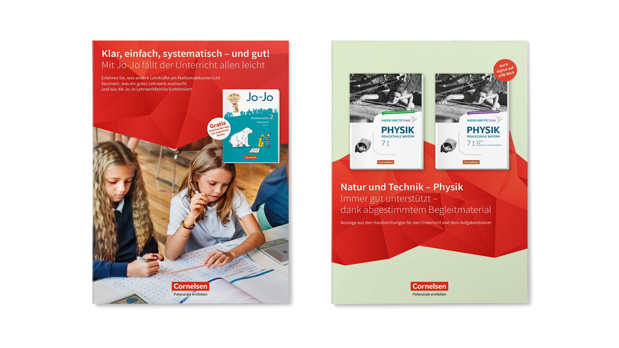
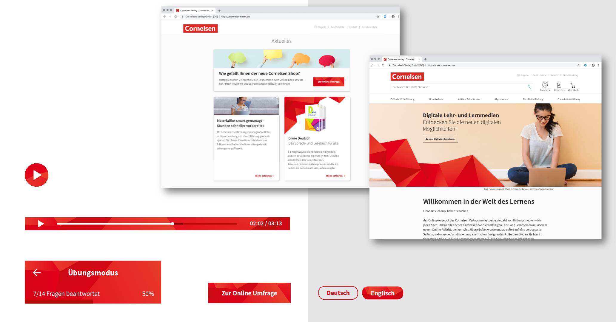
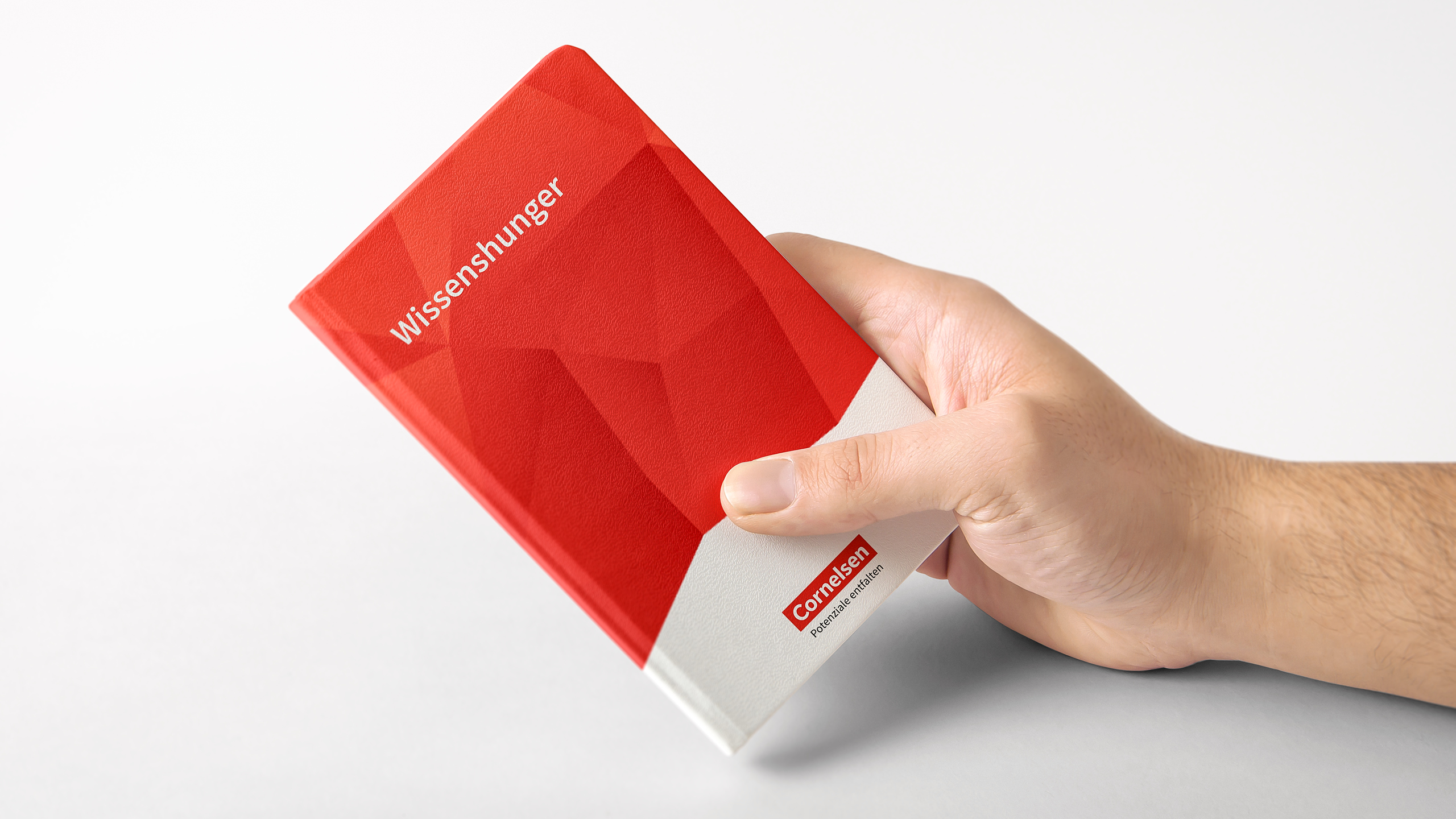
The facets impress with conciseness and recognizability beyond the logo and with their liveliness opens up diverse and flexible application options – especially in the area of illustration and animation. They take a metaphorical reference to brand values and are an expression of the new claim “Unlocking potential” (german: Potenziale entfalten = “unfold” potentials).