

Fachhochschule Brandenburg branding
The austere brick exterior of the former army barracks, in which the Brandenburg University of Applied Sciences is located, provides a stark contrast to its idyllic, water-rich environment and has always been the basis for the university logo, which had been asked to revise and add a clear corporate design.
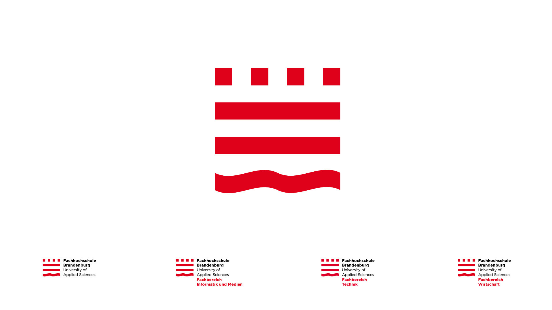
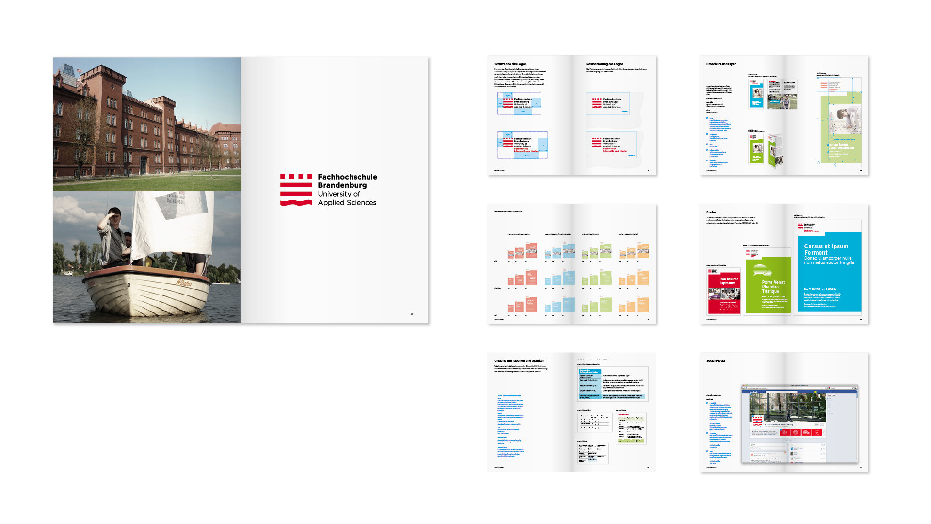


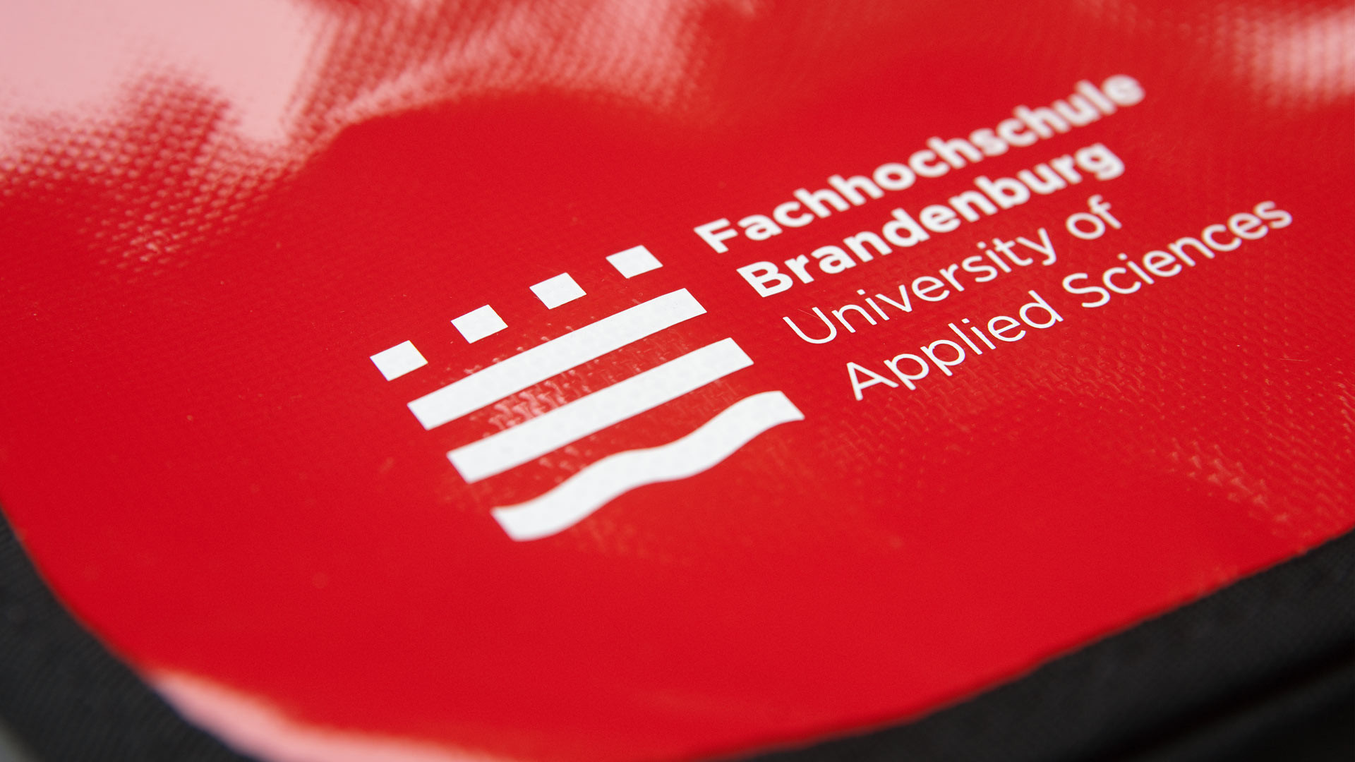
The newly designed mark redresses the balance between these two dominant elements and introduces the water theme with a simple design intervention that leaves the symbol still proudly sporting its architectural origins.
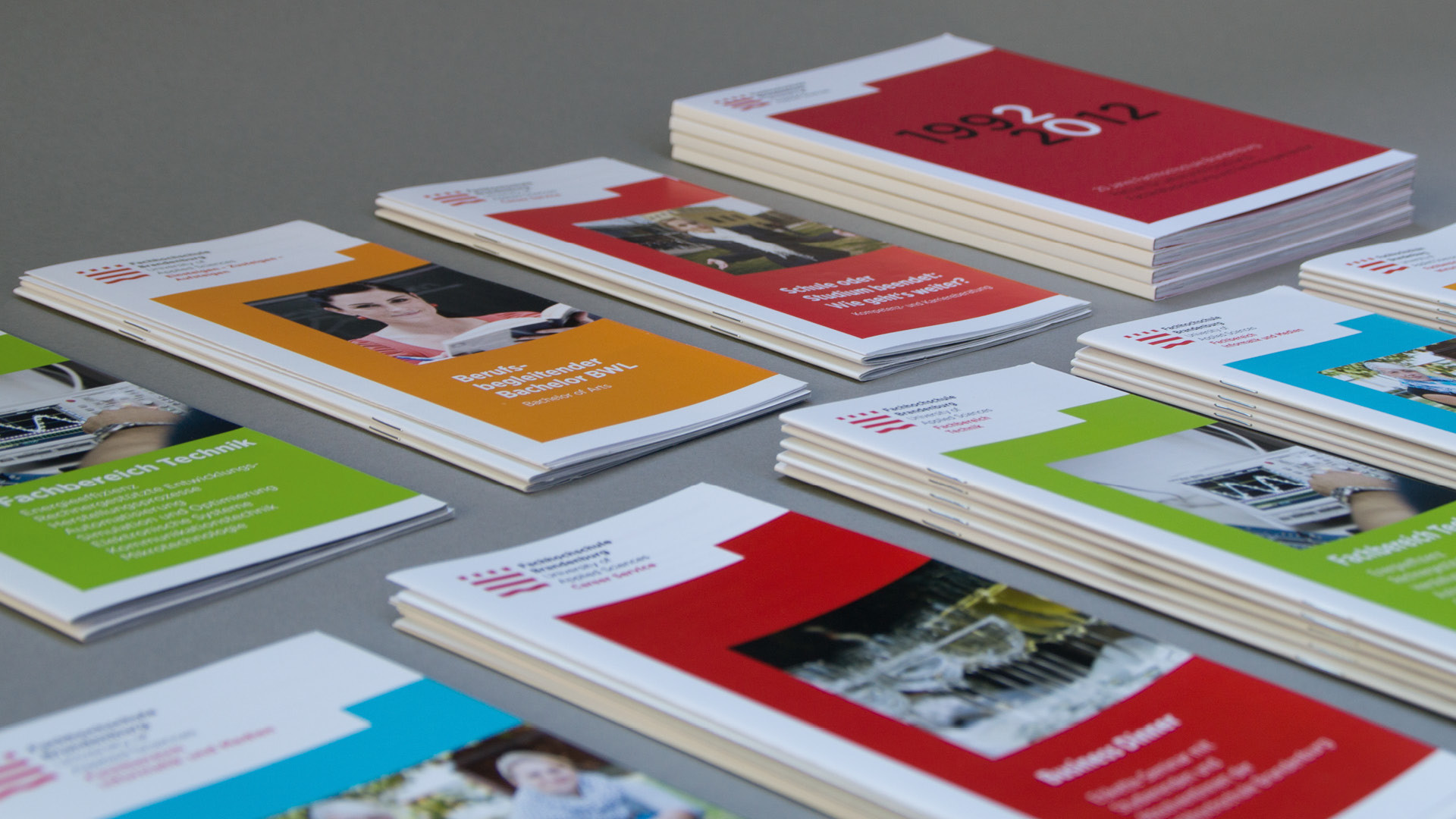
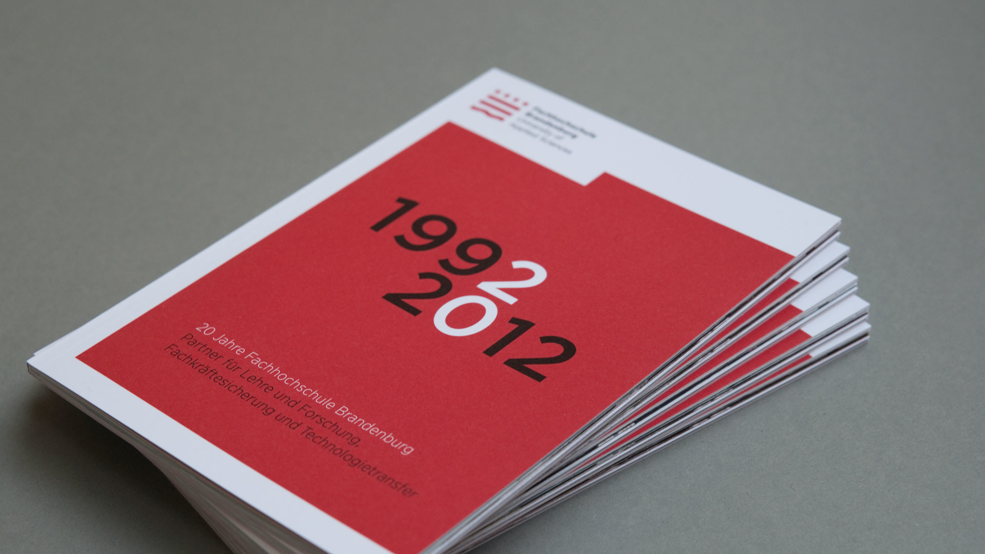
The design of the communication media required a stable appearance to develop a consistent face for the university through all media, even with daily use by university staff members, most of whom have no prior design knowledge. Templates for brochures, posters, presentations and many other applications have been documented in a comprehensive manual.
Client
Fachhochschule Brandenburg
Agency
Thomas Manss & Company
Year
2012