Hochschule Bremen
In 1982 five universities of applied sciences were merged in Bremen, that formally have worked under one roof since then, but there was a lack of consistency in appearance, coordinated strategic content and a sense of togetherness. The Bremen University of Applied Sciences reacted to these requirements and initiated a corporate identity process with kleiner und bold, which should position the strengths more clearly.
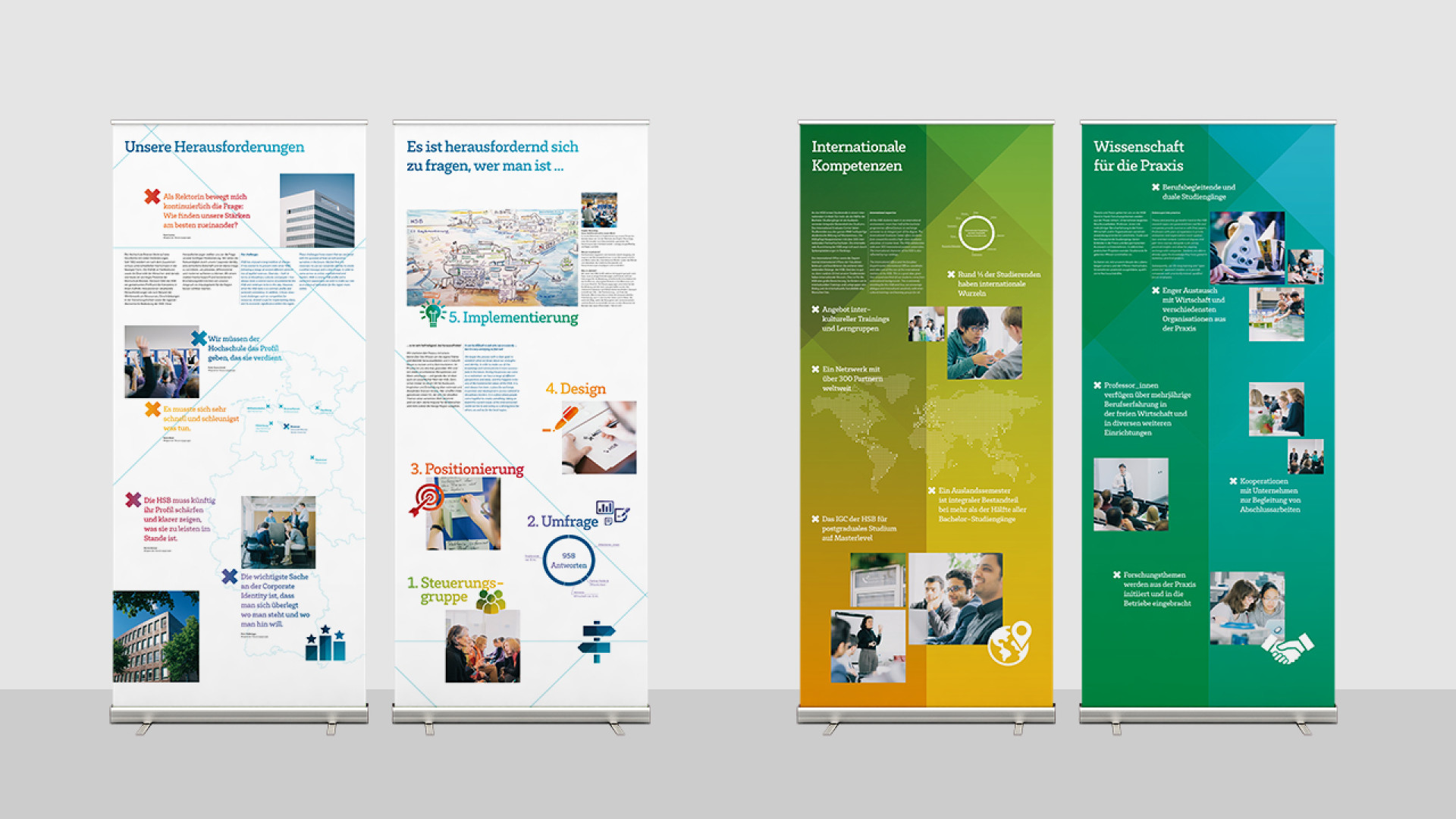
In order to create a change from individual interests to a common idea, a set of values had to be worked out that students and employees from all faculties and departments can refer to. Presentations to student representatives, course directors, dean’s offices and lectures should generate understanding for the task at hand. A 30-person steering group was recruited to ensure decision-making ability. The steering group developed value proposition based on an extensive online survey, which is the cornerstone of the strategic direction and communication.
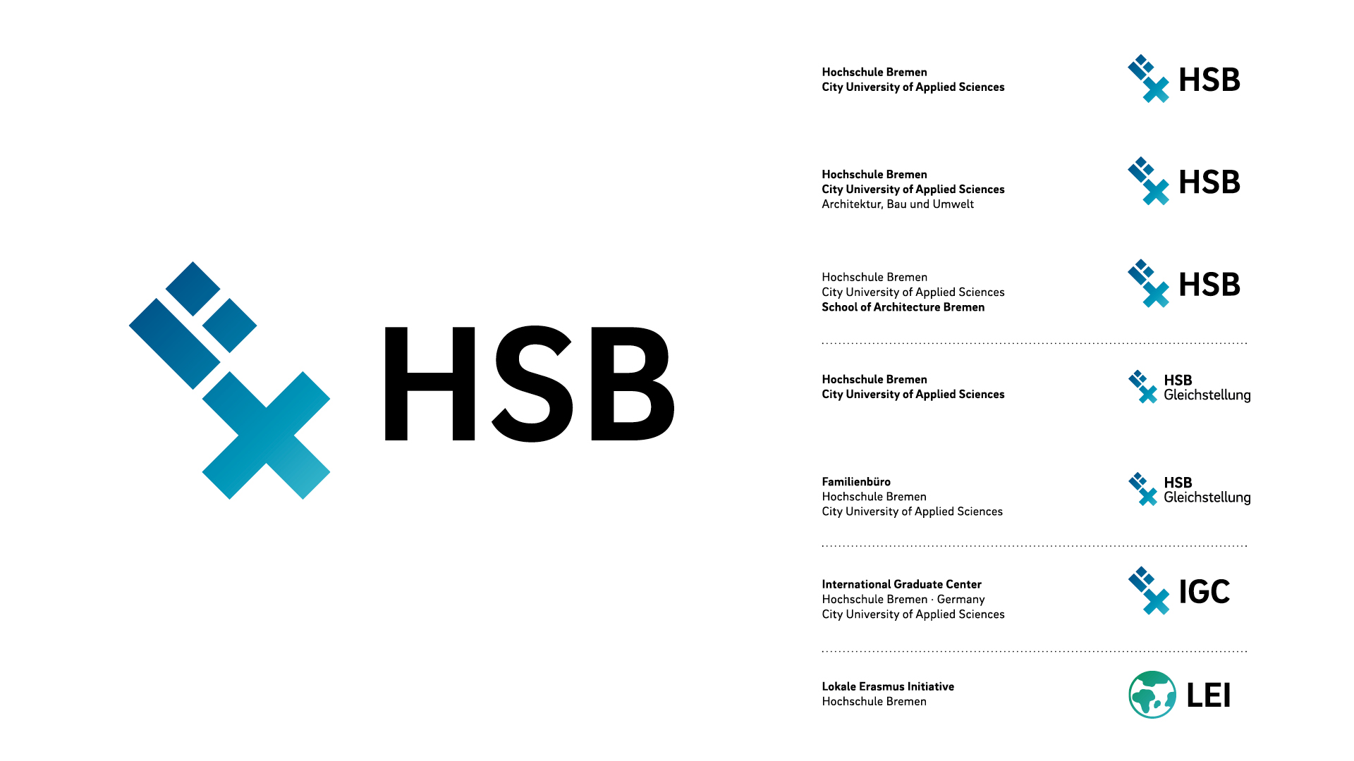
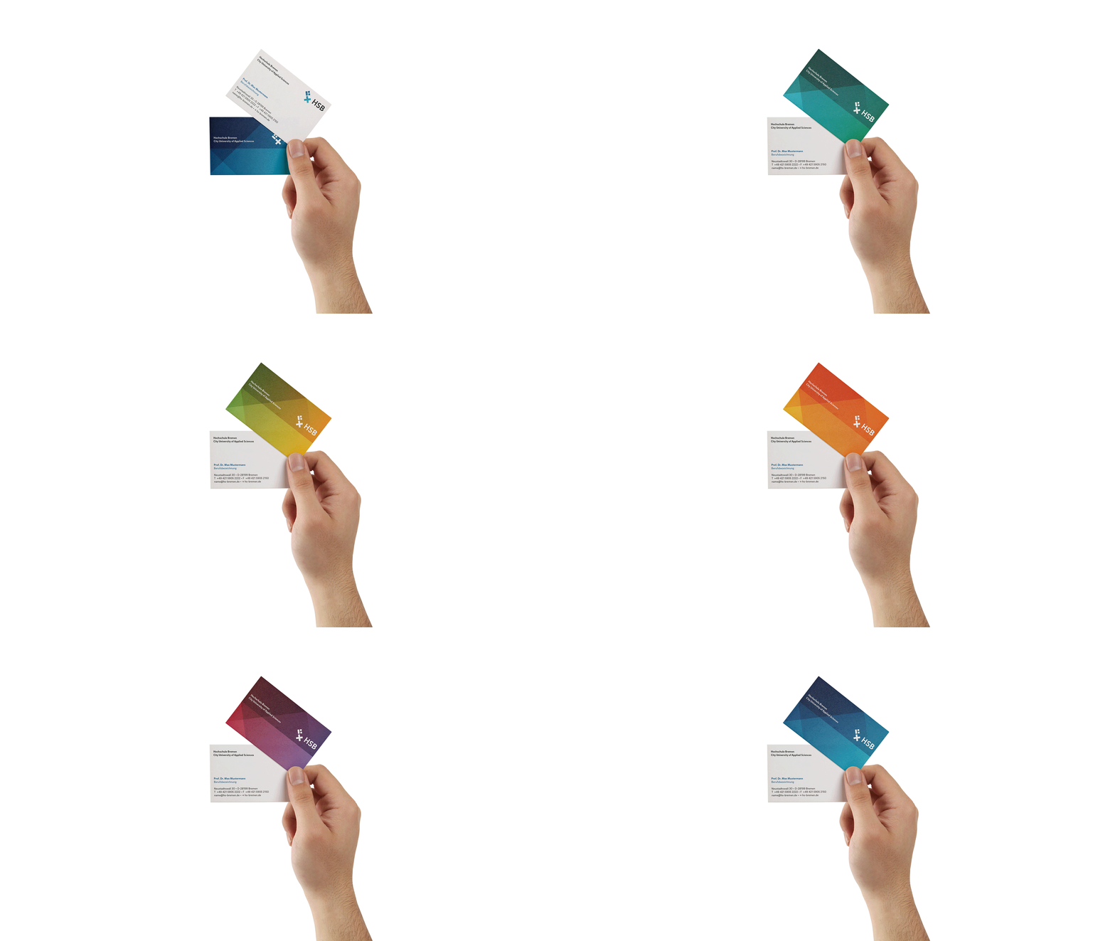
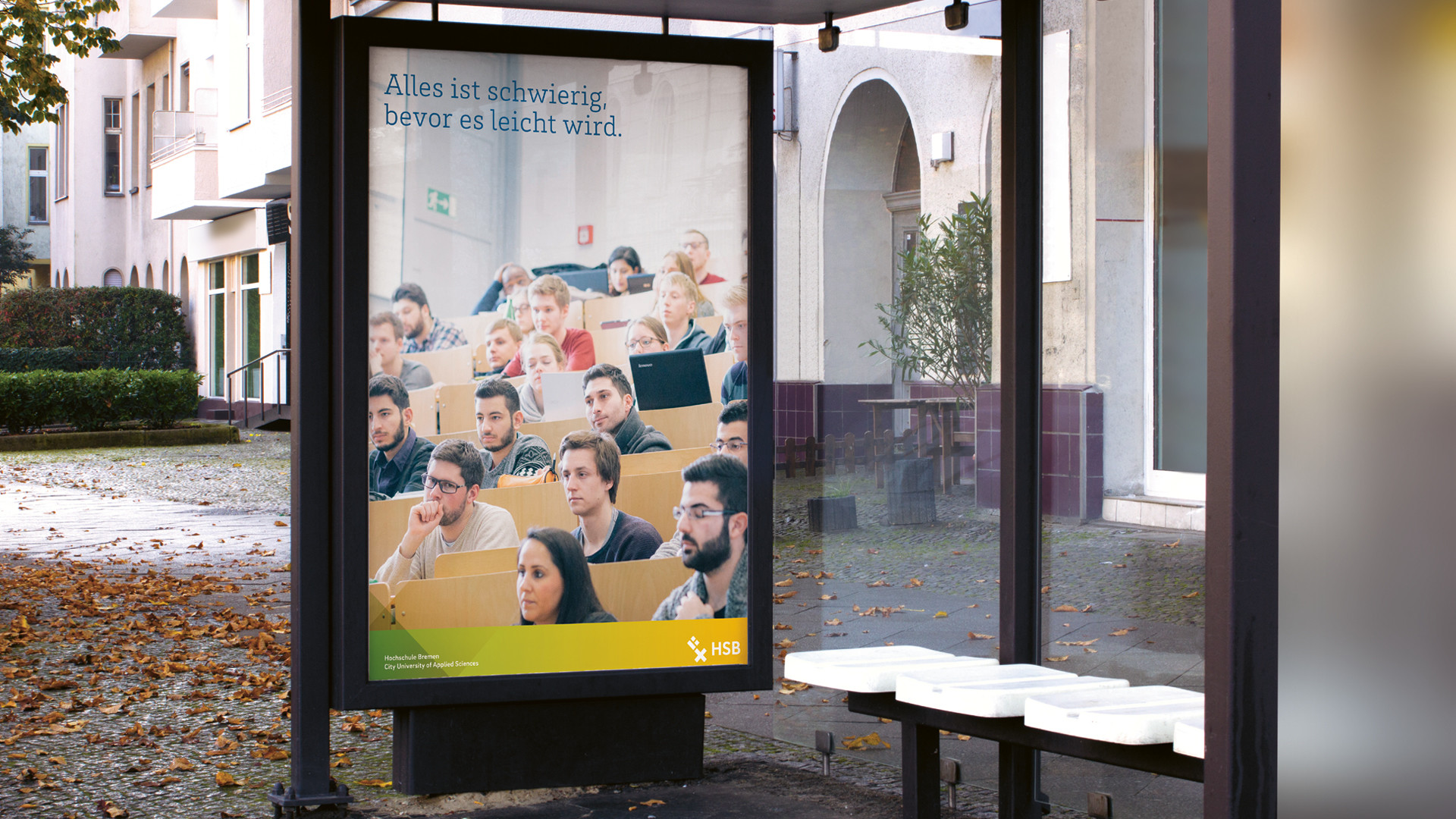
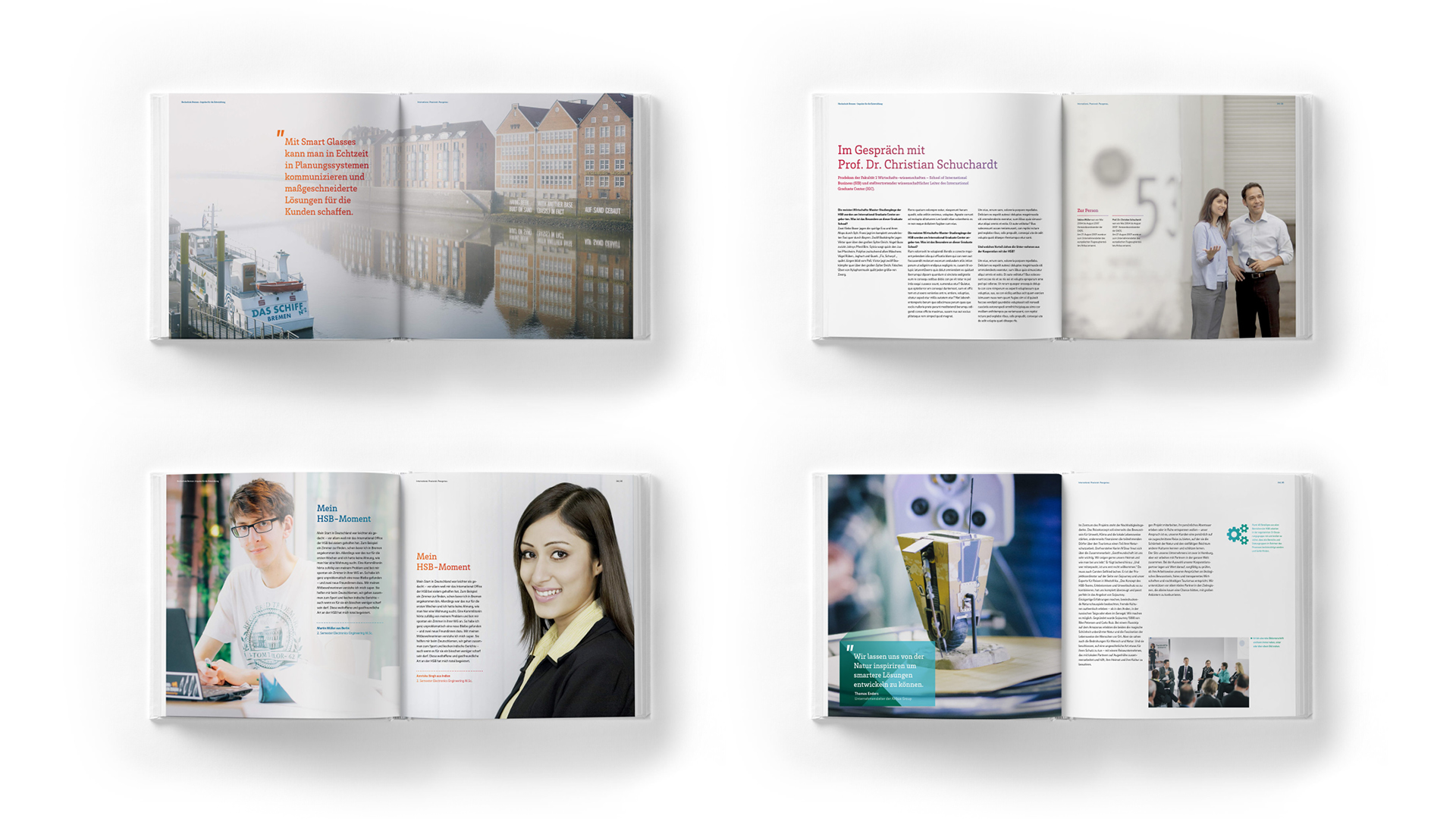
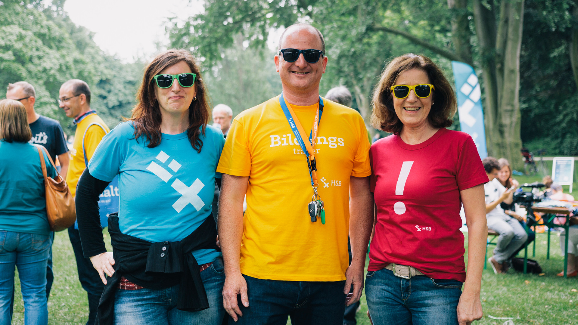
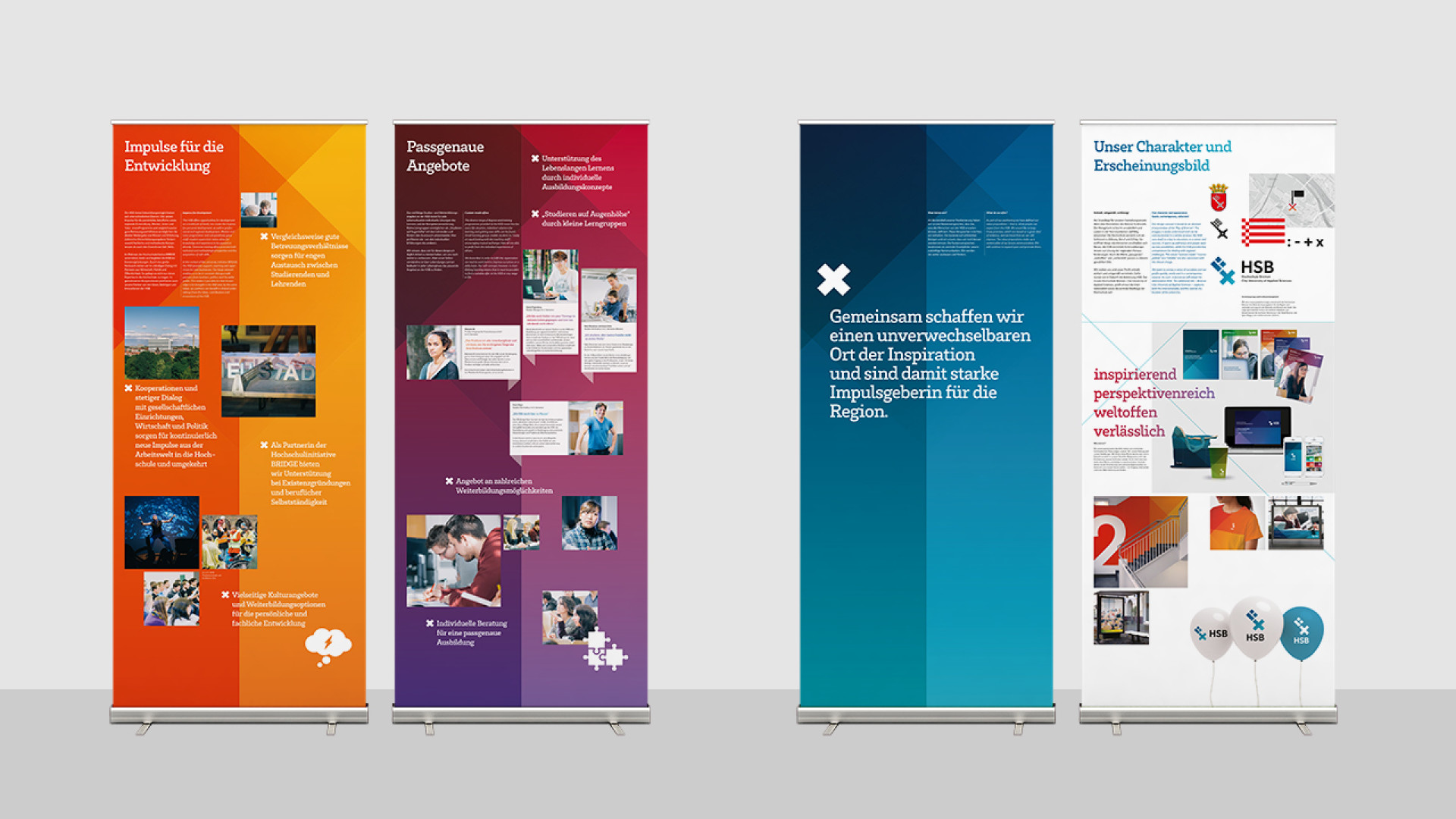
The symbol of a key was created from square, rectangle and cross. The associated imagery is understandable and diverse: the university as the key to education, career and success opens up paths, opens up new things, and imparts key skills. In this way it underlines its role as a source of inspiration and is closely linked to the heraldry and history of the city. Playful corporate design elements are created from the individual elements of the sign. Together with the multicolor, a friendly, open and perspective-rich overall picture is created.
Client
Hochschule Bremen
Agency/Year
kleiner und bold, 2014–2017


